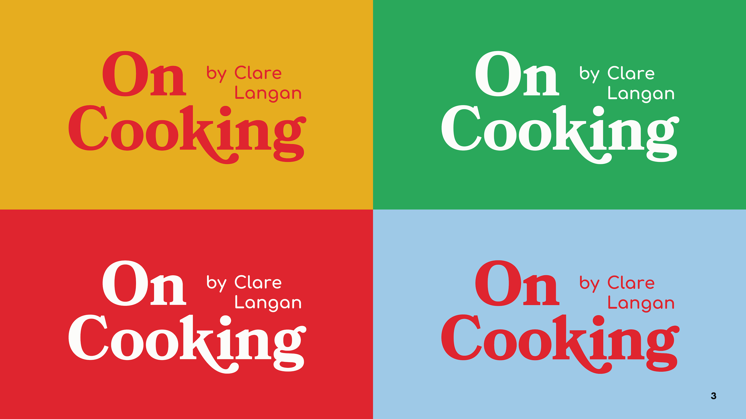
On Cooking
On Cooking: Substack Brand Identity & Visual System
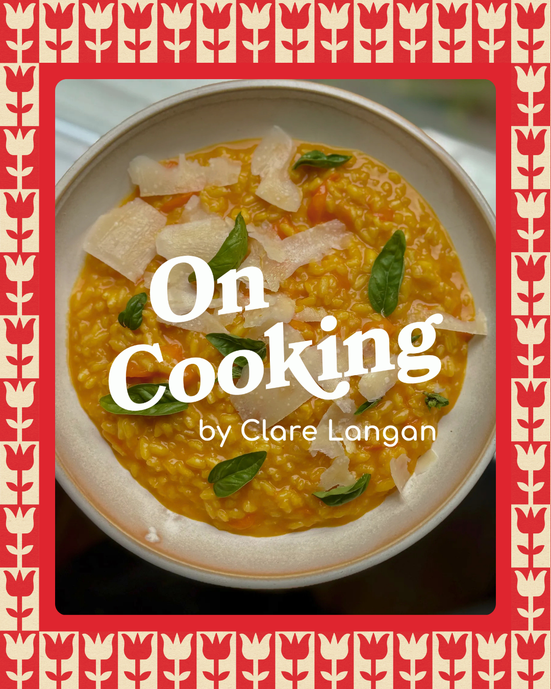
On Cooking needed a cohesive look that could carry through every post without redesigning from scratch each time. I built a flexible template system around Substack's image constraints, using safe-zone layouts that stay legible across differently cropped placements (thumbnail, archive, and social preview). The result is a repeatable, recognizable brand presence that works for both existing subscribers and new readers discovering the newsletter through shares.
PROCESS & OUTCOME
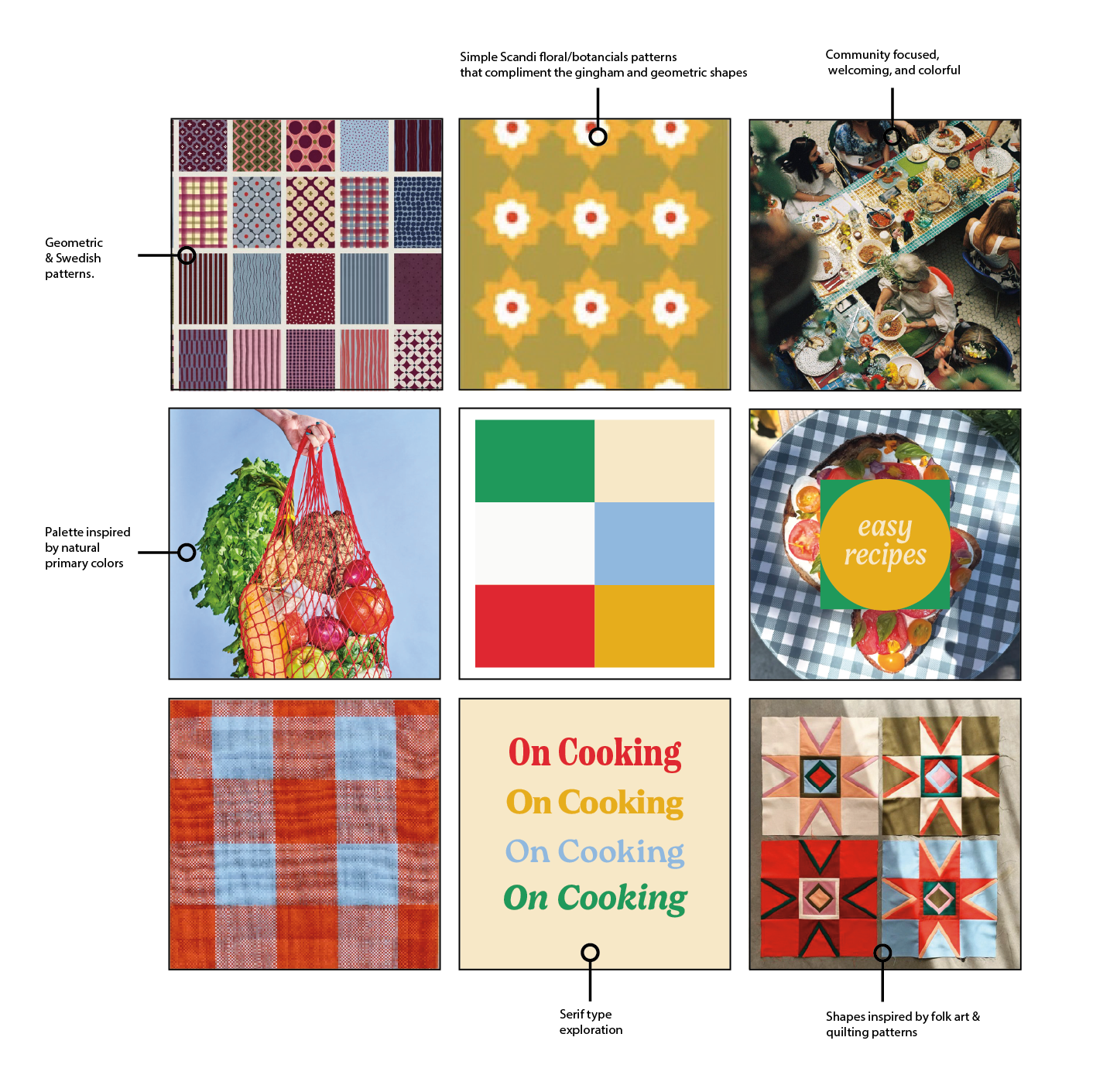
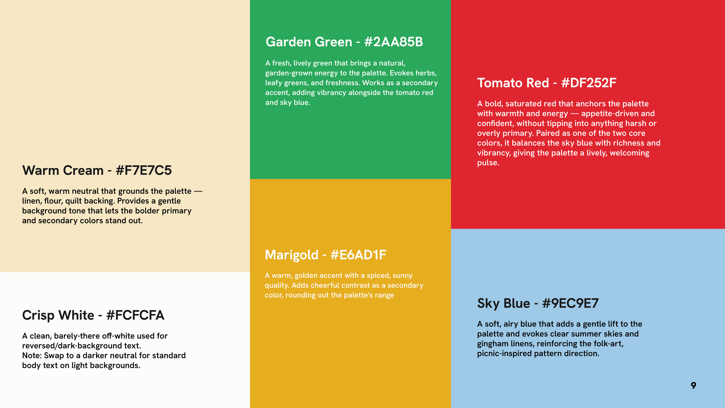
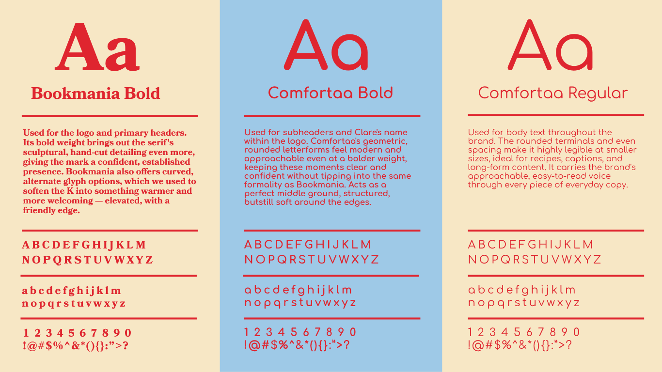
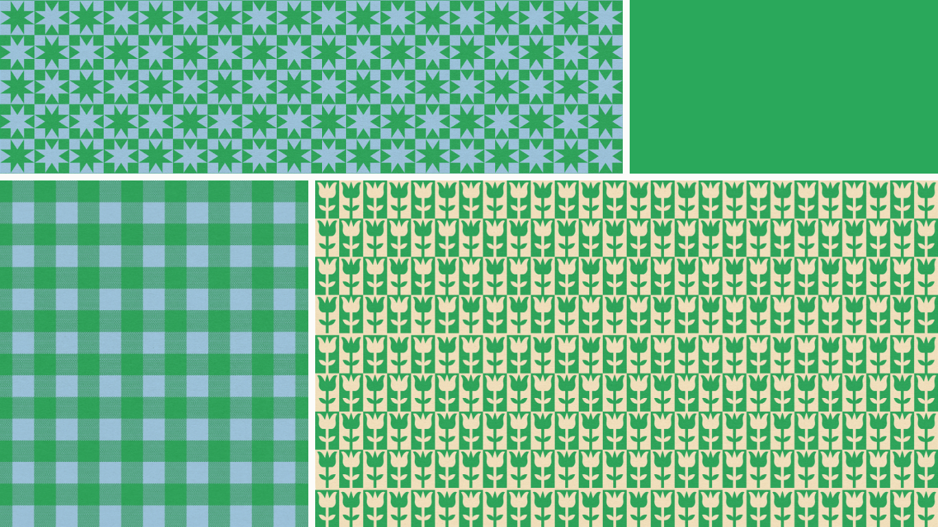
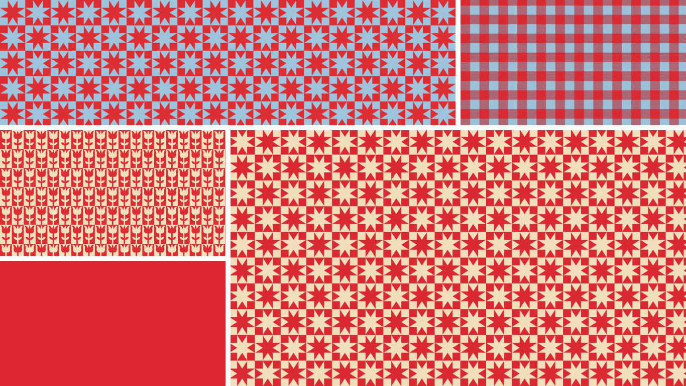
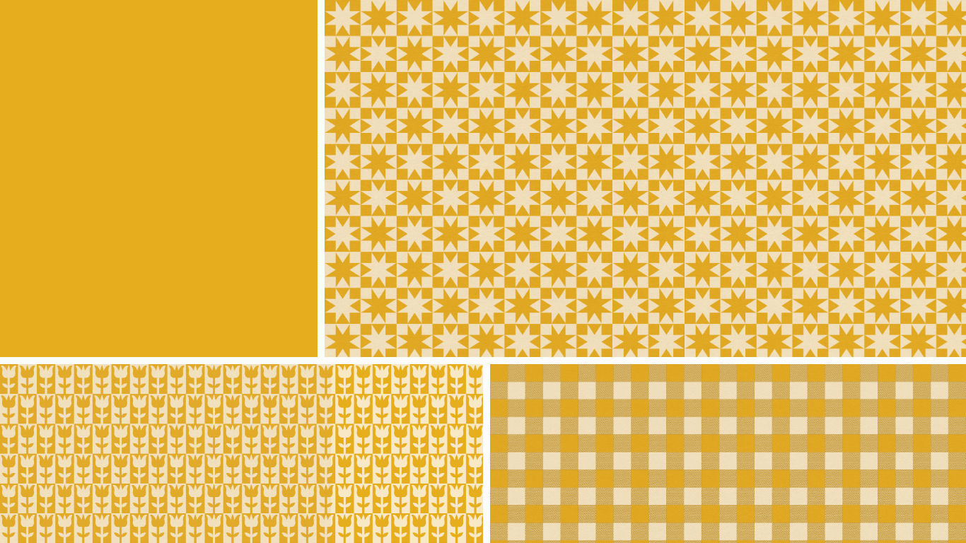
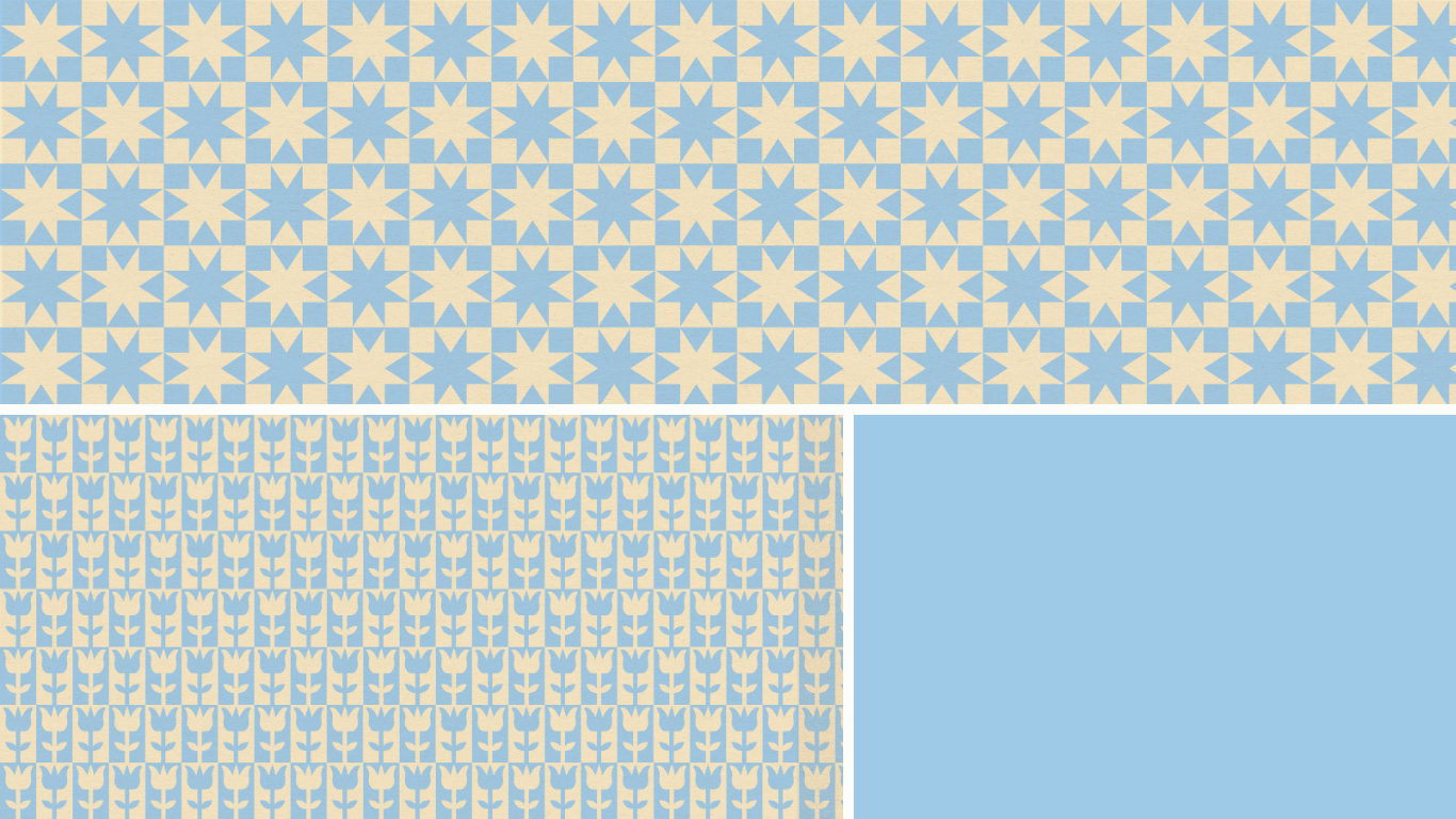
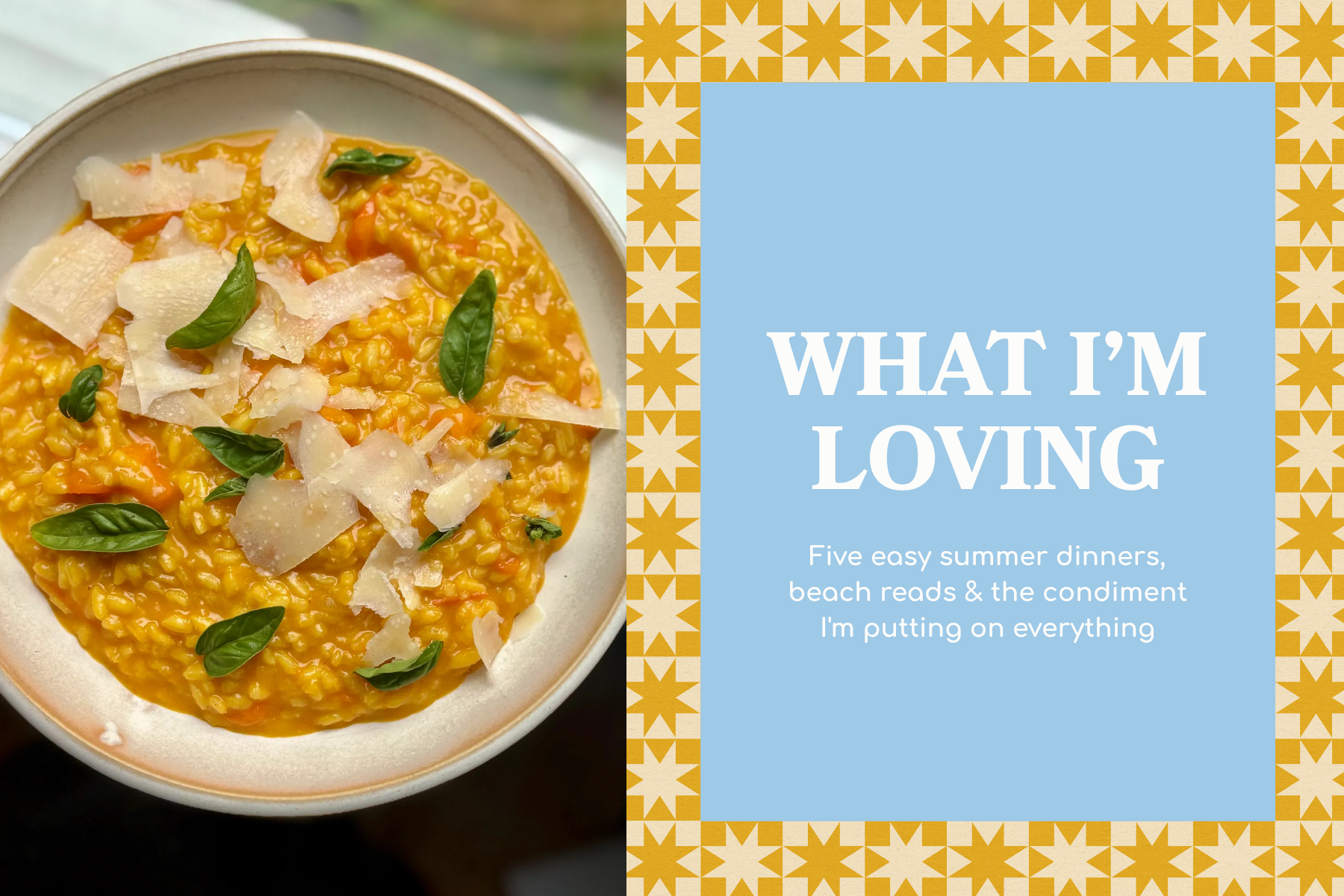
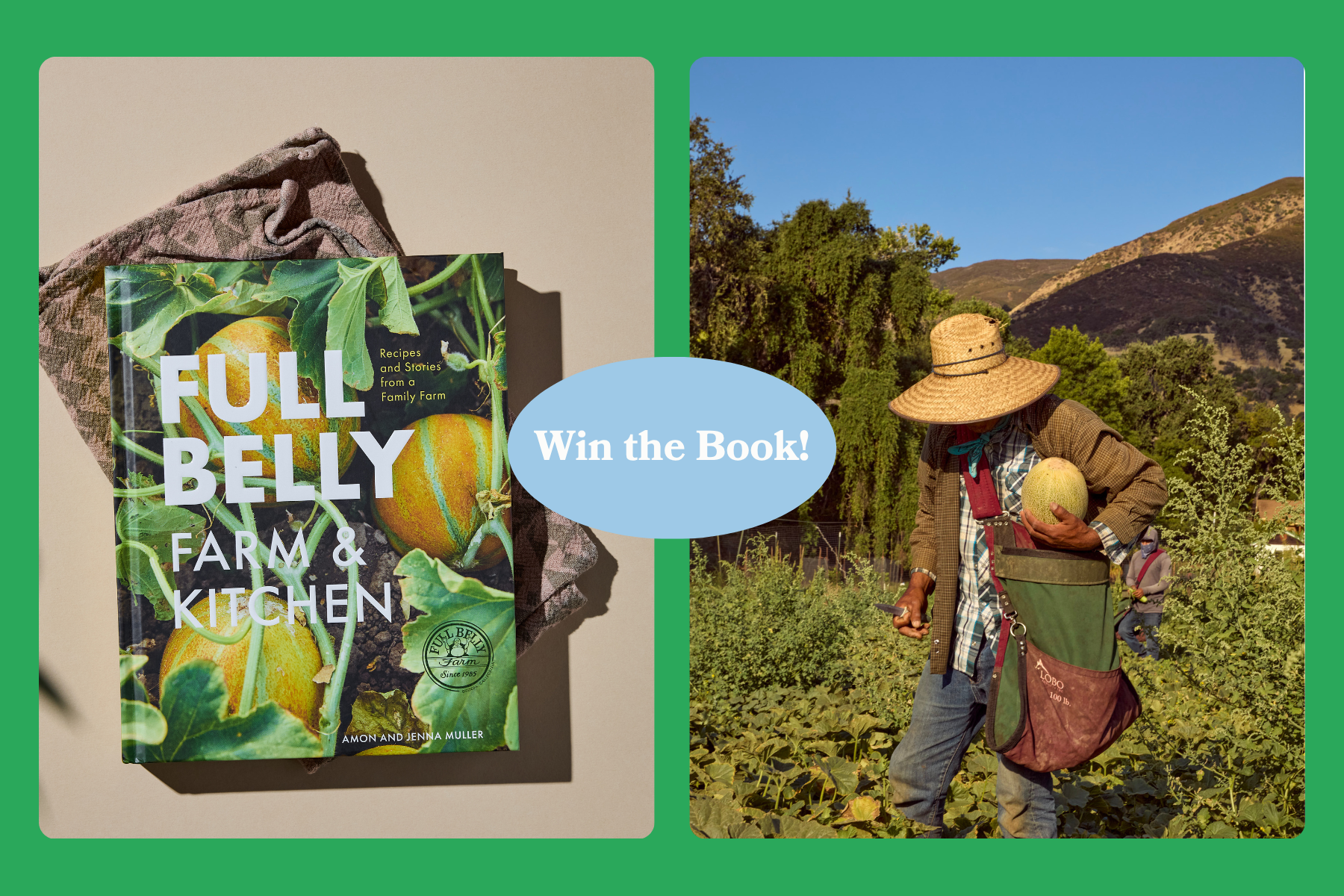
The brand needed to be lively and appetizing, with a bright palette and type system that could flex across formats. I landed on a creative direction that felt whimsical but elevated: bright colors that read as friendly and grounded, drawing inspiration from folk art and Scandinavian patterns to give the brand a distinct, handmade warmth without tipping into twee. The biggest challenge was Substack itself: it crops each cover image differently depending on where it appears (homepage thumbnail, archive, social share preview), so early designs looked right in one place and cut off in another. I researched how the platform handles cropping, including the difference between its centered and smart-focus modes, and found that smart focus was sometimes misreading images and pushing the subject off-center. I rebuilt the templates around a safe zone, keeping key text and imagery in the center of a social-preview-sized canvas (1200×630) so the important content survives every crop, then tested layouts across placements and adjusted the account's cropping setting to make results more predictable.
The client now has a full brand toolkit and a repeatable template system that holds up across thumbnails and social previews, plus clear guidance on how Substack's cropping works, so future posts don't require guesswork.
LOGO SYSTEM
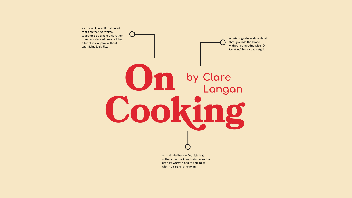
Logo Variations
A subtly slanted take on the primary logo, adds a bit of energy and edge without straying from the brand's core typography. This works well for moments that want a touch more movement or personality, like social graphics, stickers, or anywhere the brand can feel a little more playful and dynamic.
Horizontal Version
A horizontal lockup of the same logo, designed for spaces. where a stacked mark won't fit — website headers, email banners, or wide packaging surfaces. It keeps all the same typographic and detail choices, just reformatted for width-constrained placements.
Having both alternates on hand means the logo stays flexible and consistent across different applications — the primary mark can lead, while the slanted and horizontal versions flex to fit the space or mood without needing to redesign anything from scratch.
ALTERNATIVE
SECONDARY
COLOR PALETTE
TYPOGRAPHY
PATTERNS
SUBSTACK & SOCIAL MEDIA TEMPLATES
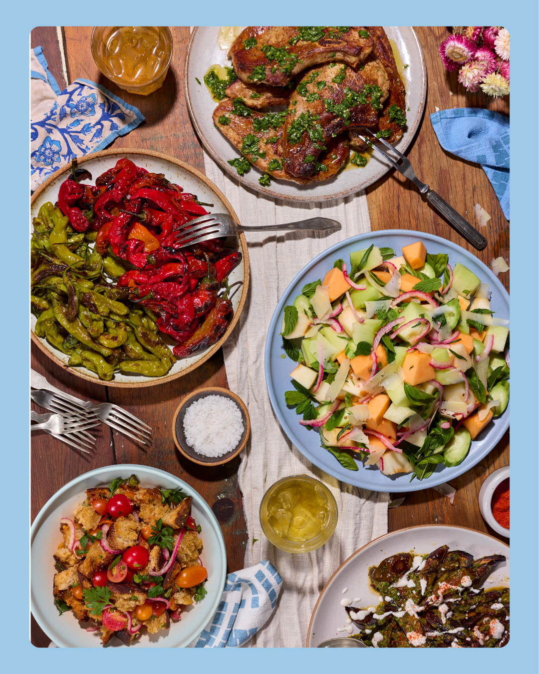
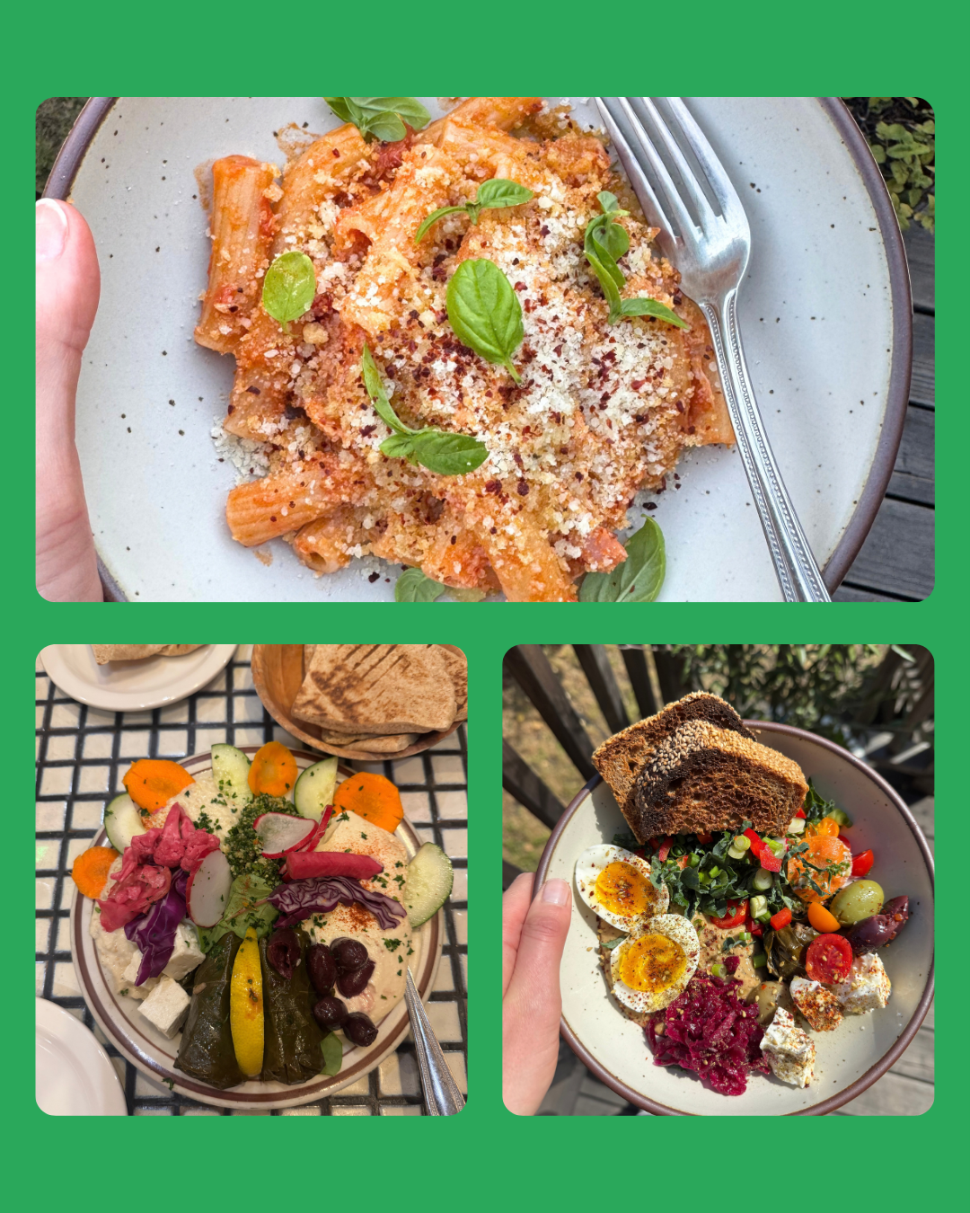
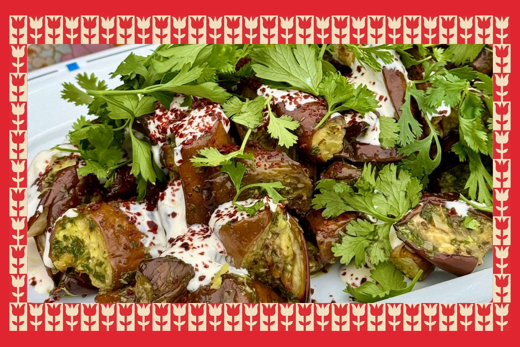
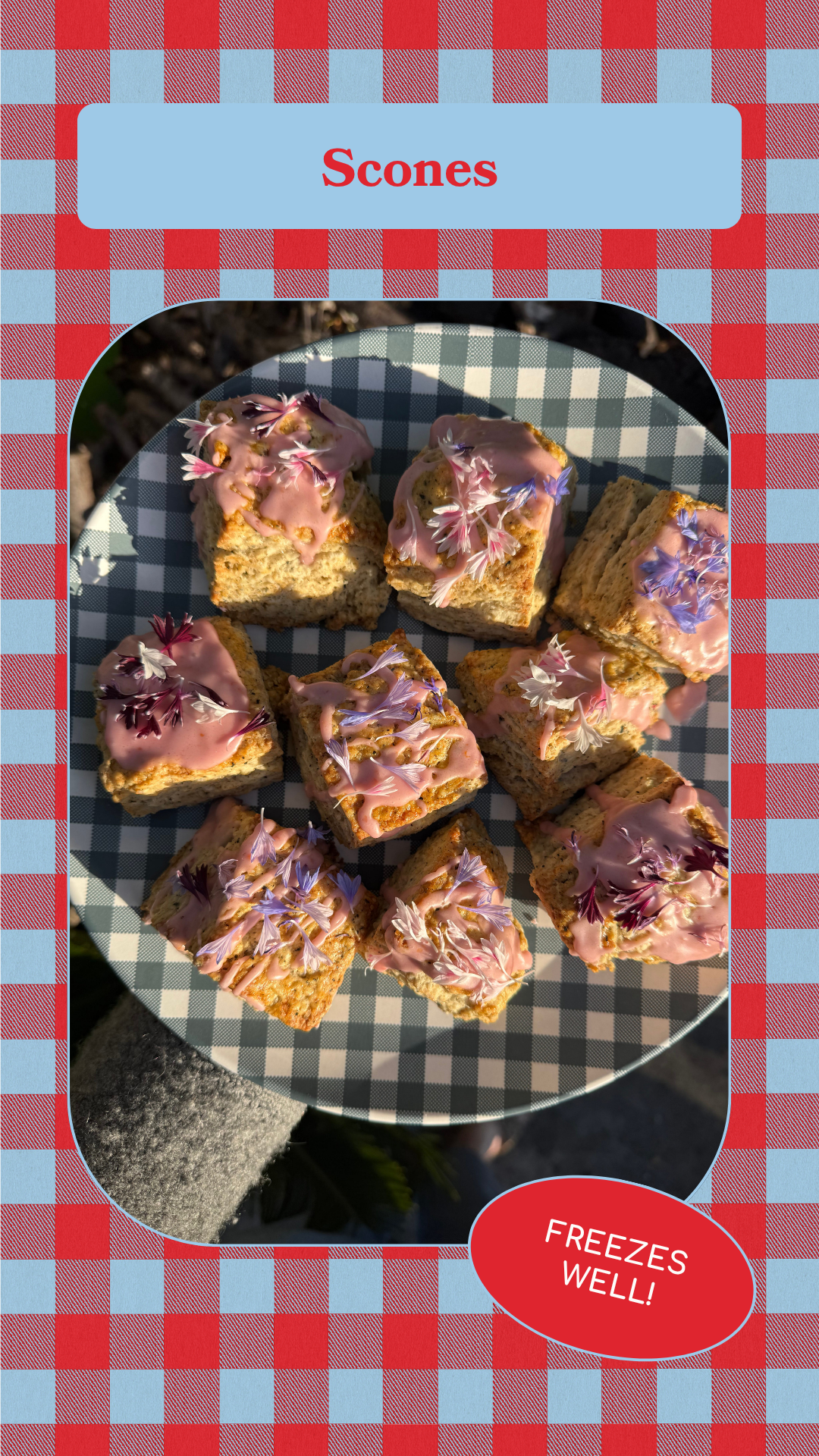
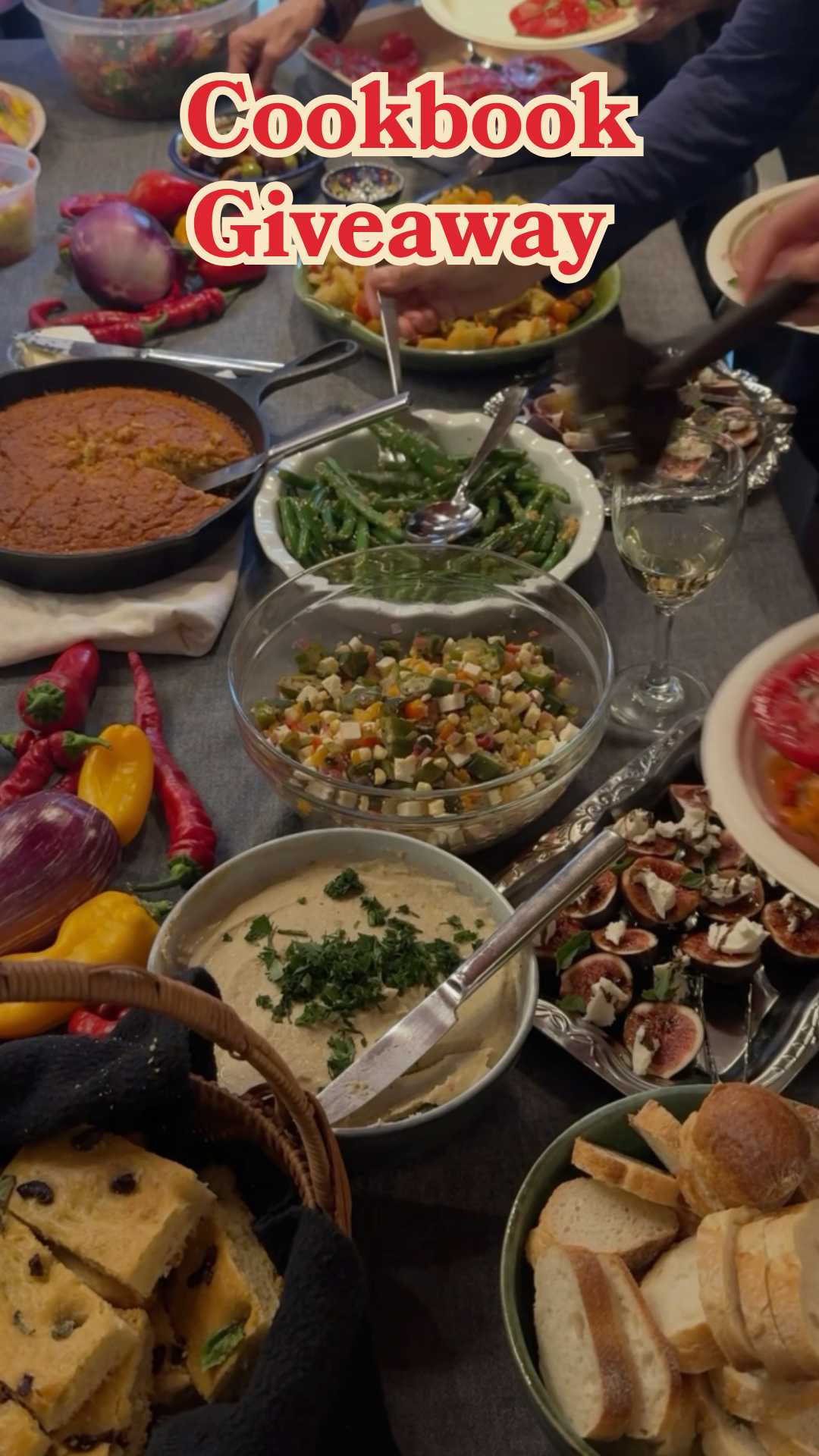
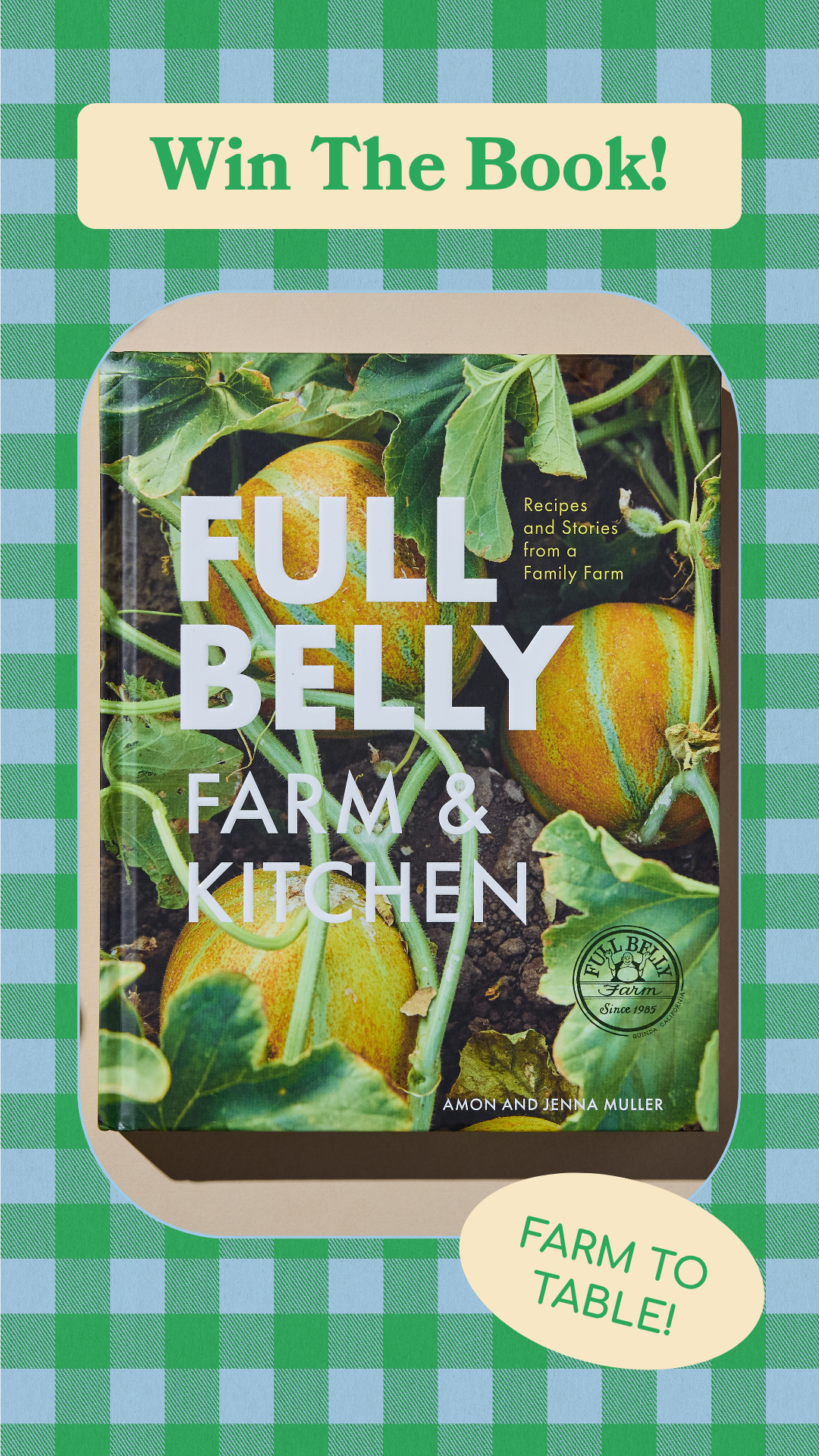
The final toolkit gives On Cooking a consistent visual language across every touchpoint, built to hold up no matter where or how an image appears. It includes a Substack header that anchors the newsletter's homepage, cover image templates designed around a safe-zone layout so key content survives Substack's inconsistent cropping across thumbnails, archive views, and social previews, imagery templates for in-post visuals that keep the folk-art-meets-Scandi pattern language consistent post to post, and Instagram Story templates that extend the same palette, type, and pattern system to social, so the brand feels unified whether a reader finds On Cooking on the newsletter or on Instagram.
Each template was built to be easy for the client to reuse and adapt without needing a designer for every post, keeping the whimsical-but-elevated feel consistent across every format.
Instagram Story & Reel Covers

Substack Headers

Substack Cover Images
Substack Image Templates